Color · Look dev
The neon-saturated grade: how we built the look for Neon Vesper
Pink, teal, deep shadow. A walk through the LUT development process for our neo-noir season.
01 · The look brief
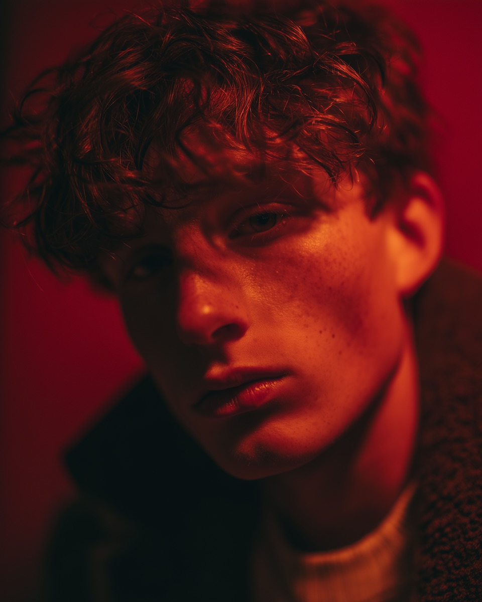
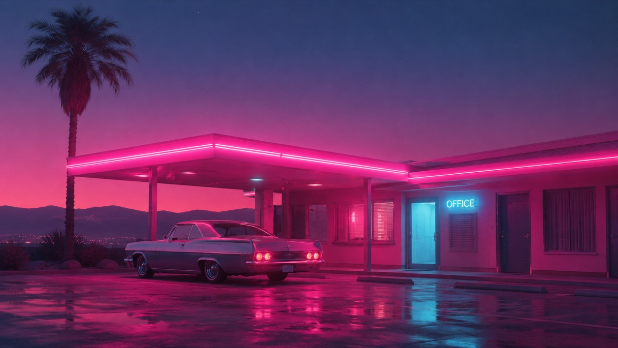
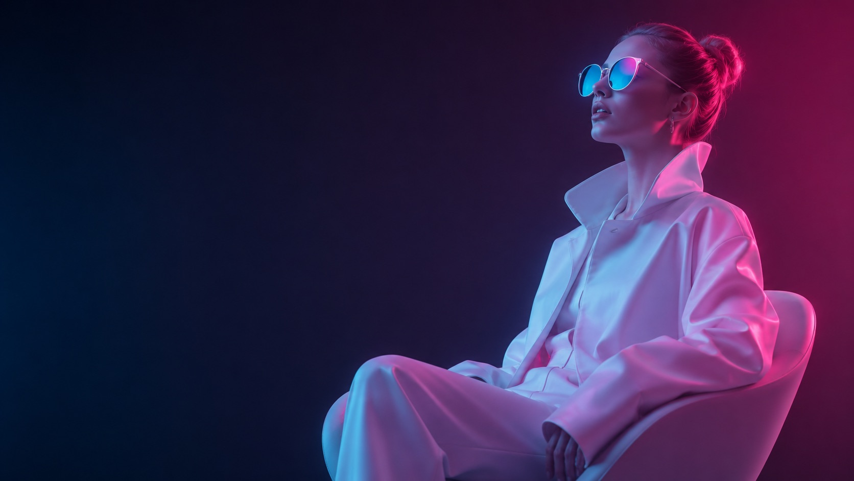
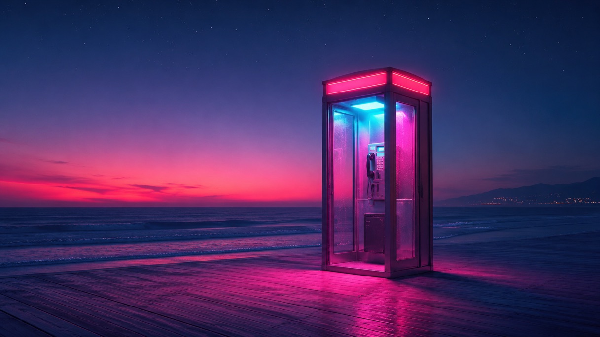
Neon Vesper is a neo-noir set in a rain-soaked future city. The director wanted hot pink, deep teal, and the kind of contrast that makes faces feel cinematic — not Instagram.
That brief sounds simple until you start grading. Pink that survives streaming compression is hard. Deep teal that doesn't crush the actors' eyes is harder. We spent ten weeks on look development before a single hero shot got graded.
02 · The LUT chain
We built a four-stage LUT: input transform, creative contrast, hue rotation, and a final printer-light emulation. Each stage was developed in isolation and stress-tested on faces, water, and neon highlights.
The hue rotation stage is where the season lives. We pull magenta away from skin tones in two small bands, then push the city neon back into saturated pink. It feels intentional in every shot.
"Pink survives, or your show doesn't."
— Niko Petrov, Color Director
03 · Show LUT vs final LUT
The show LUT (used on set) is 80% of the final. The final LUT adds a creative grain plate, a 600-nit peak cap, and a custom rolloff on the highlights. We never use them interchangeably.
04 · What we learned
Don't grade for the producer's monitor. Grade for the home set. Test on three displays before you sign anything.